Colors drawing us in.
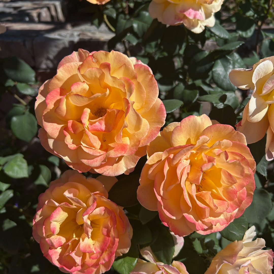
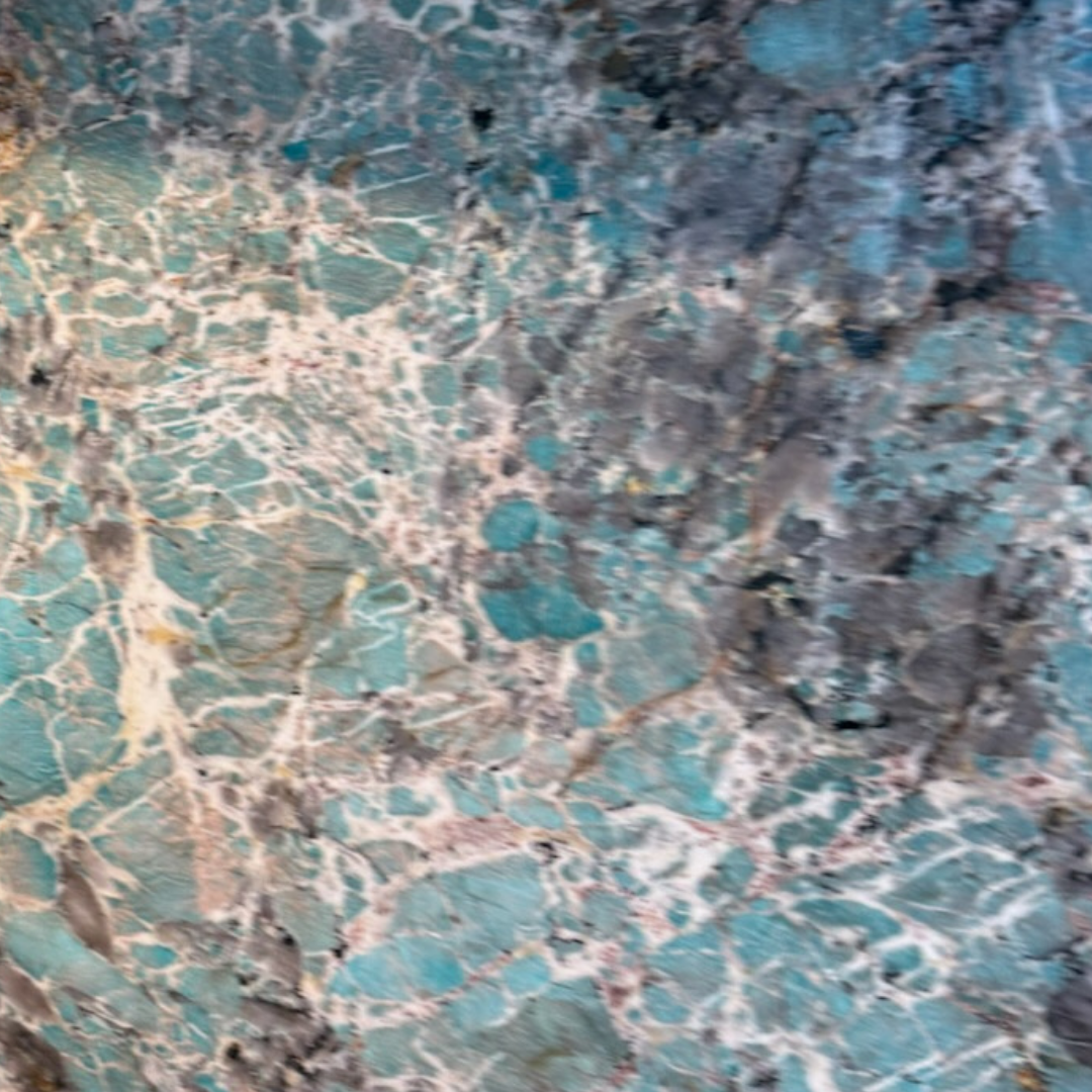
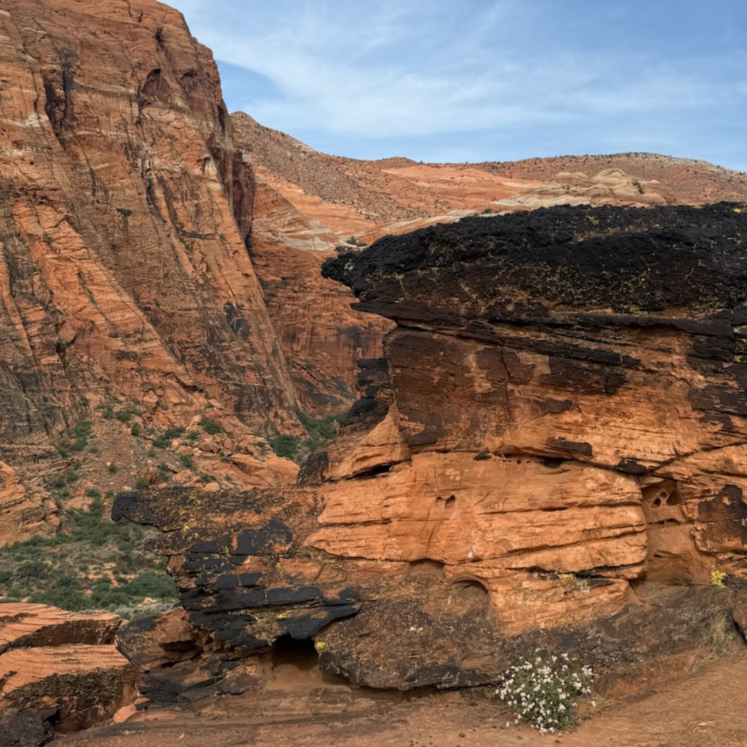
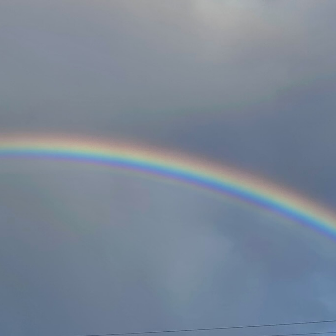
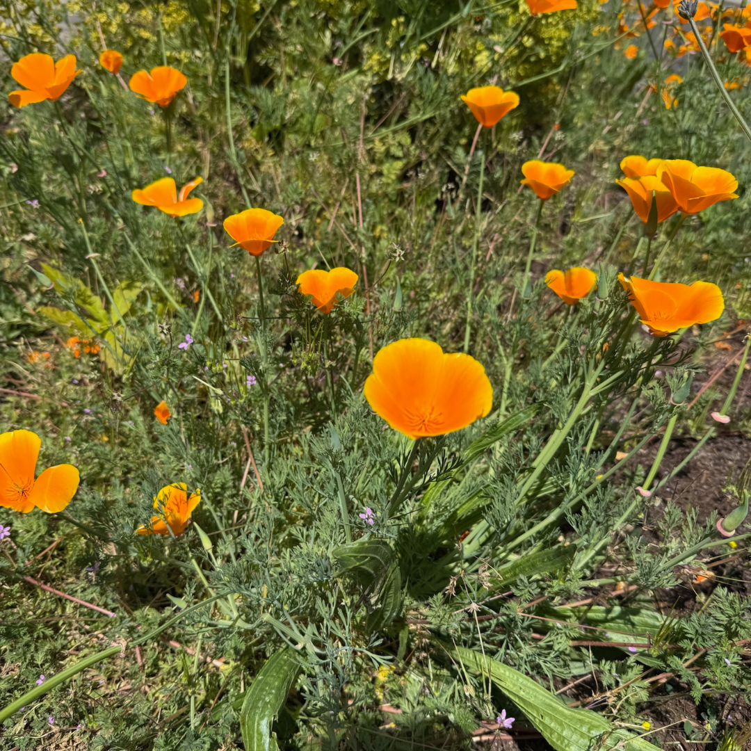
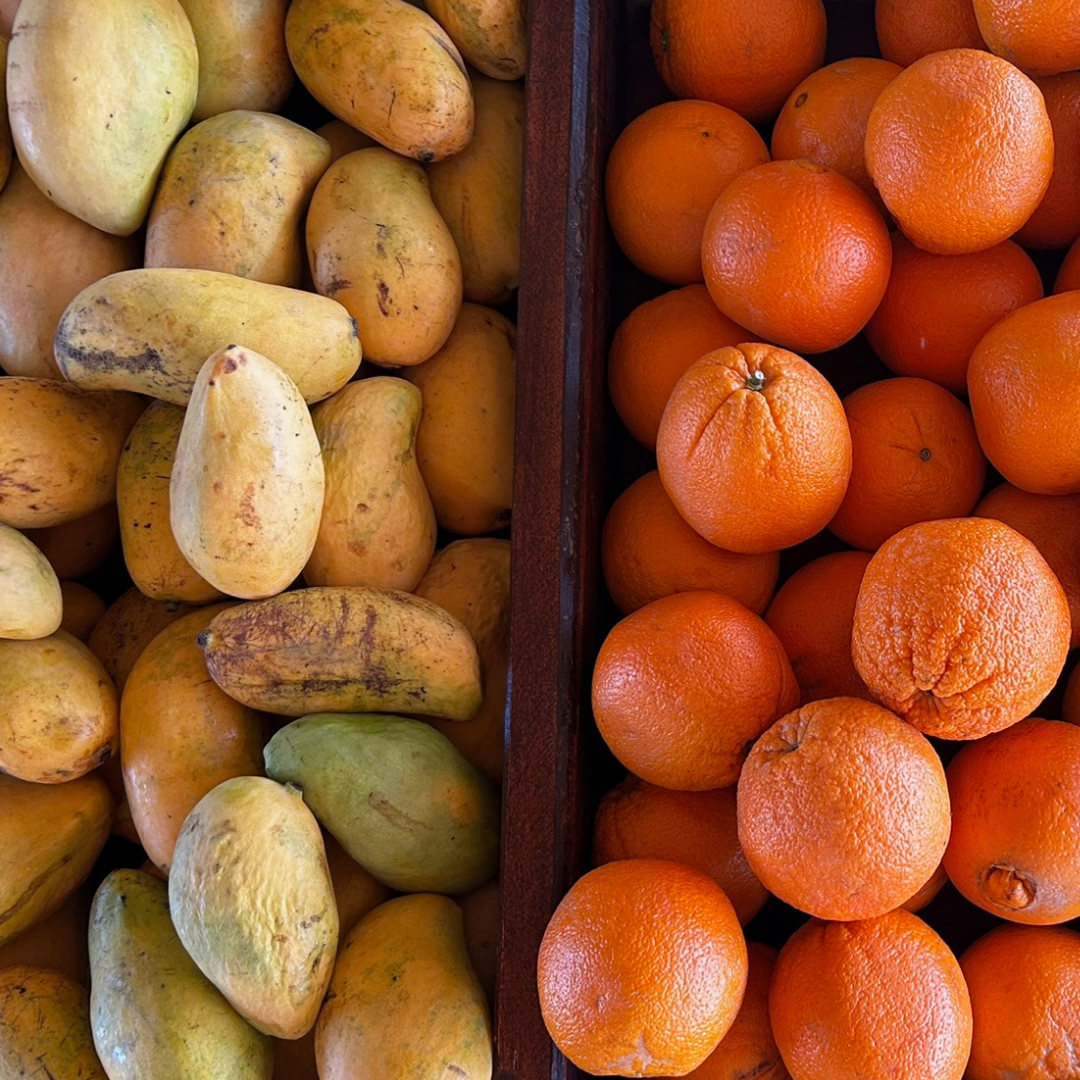
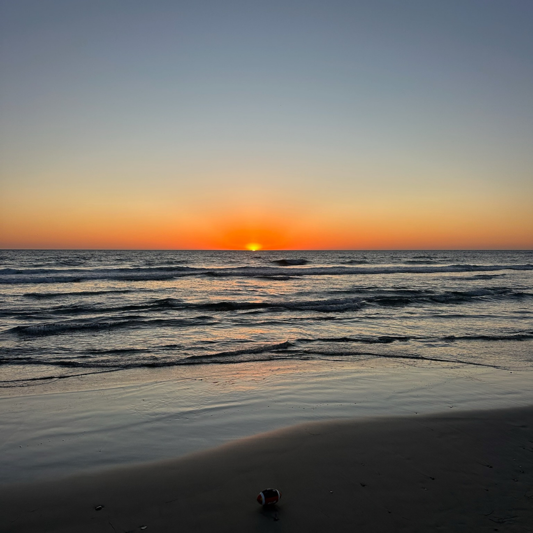
A garden rose suspended between peach and copper. Poppies so saturated they read luminous. Stone veined in teal and rust. A horizon compressed to single bands of amber. The throughline impossible to ignore: nature has never played it safe with color, it’s why she grabs our attention.
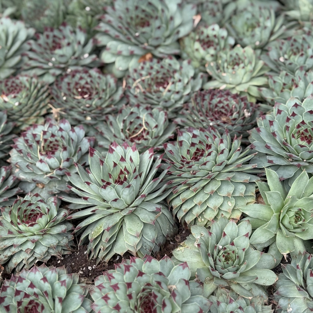
She layers burnt orange against dusty sage, drops cobalt into a field of straw, lets coral exist loudly next to rust. There is no second-guessing. No playing it safe.
As designers we spend a lot of time coaxing clients toward color, past the fear of commitment, past the pull of the safe and the neutral. These photos acknowledge what we keep coming back to. The most enduring designs on earth run on bold, fearless color. The question isn't whether ones space can handle it, it's whether one can embrace the unexpected and risk finding something of awe.